Forum profili kısmına imza alanı gibi ekstra bir textarea ekleyip buraya yazılanları members tablosundaki istediğim sütun içine yazdırmak istiyorum. Nasıl yaparım? Bir kaynak var mı bununla alakalı?
- Türkçe Smf Teknik Destek Sitesi forumuna hoşgeldiniz.
Türkçe Smf Teknik Destek Sitesi
Türkiyenin İlk Türkçe Smf Destek Sitesi
Bu özellik size üyenin attığı tüm iletileri gösterme olanağı sağlayacaktır. Not sadece size izin verilen bölümlerdeki iletilerini görebilirsiniz.
Sayfa1
#1
SMF 2.0.x Karşılaştığınız Sorunlar ve Çözümleri / Forum profili alanına nasıl ekstra textarea ekleyip veri yazdırabilirim?
29 Haz 2020, 02:04 #2
Profil / SMF 2.1RC2 Üye Olurken Avatar Seçme [Select Avatar] Mod
15 Haz 2020, 17:54Mod 2.1'e uyumlu hale getirildi; avatar seçmeden de üye olabiliyor kullanıcılar, galiba bu orijinalinde böyle değil fakat şimdilik çözümünü bulamadım. Bulunca güncellerim konuyu.
localhost'da modu güncellediğim için bir sunucuda hata çıkma olasılığı var, eğer hata alırsanız konu altına yazın.
Dil dosyalarıyla da ilgili güncelleme yapacağım şimdilik sadece ingilizce.
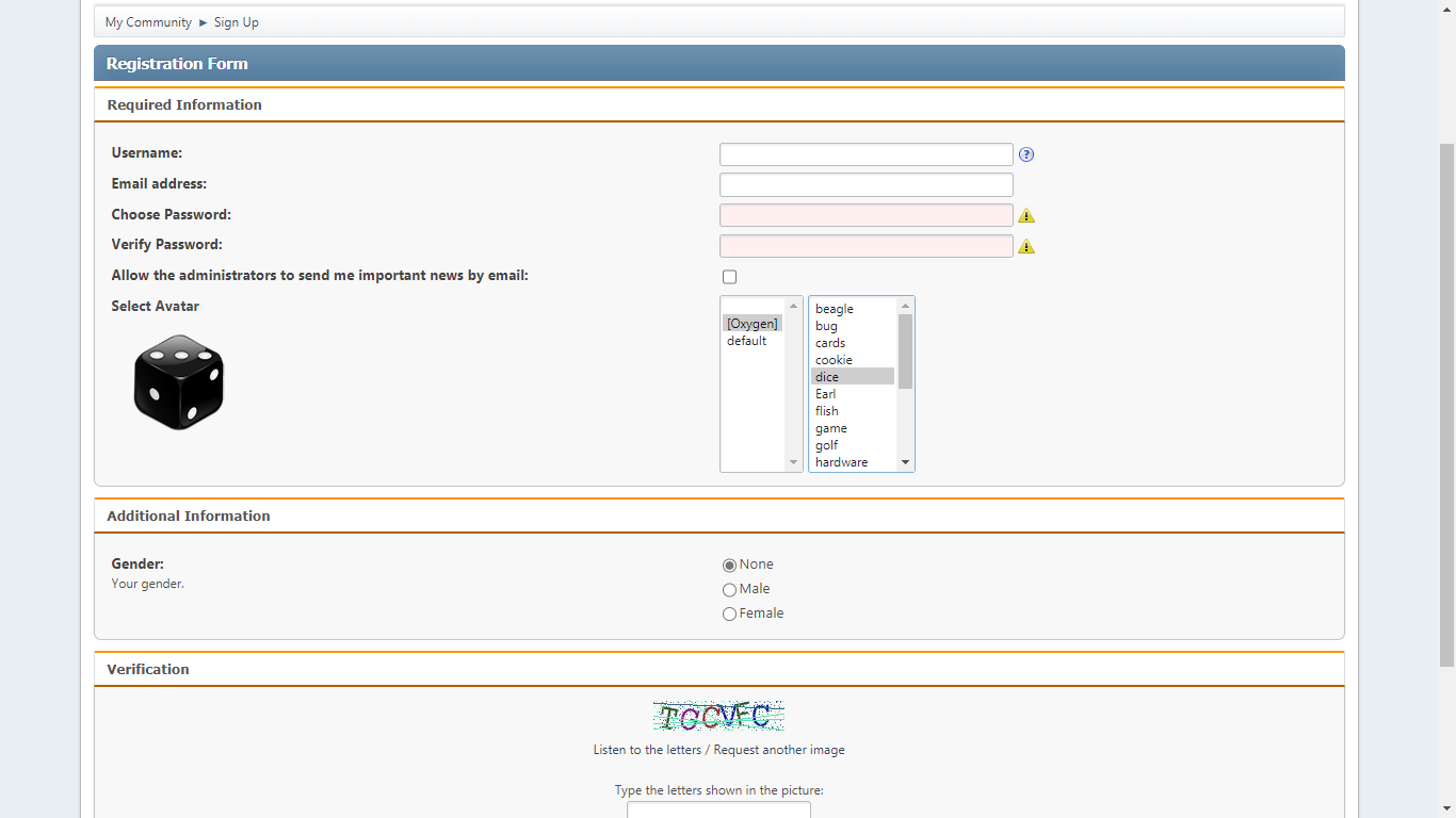
localhost'da modu güncellediğim için bir sunucuda hata çıkma olasılığı var, eğer hata alırsanız konu altına yazın.
Dil dosyalarıyla da ilgili güncelleme yapacağım şimdilik sadece ingilizce.
#3
Profil / SMF 2.0 Xenforo Tarzı Profil Alanı [Yapılıyor]
15 Haz 2020, 11:52
Henüz yapmakta olduğum Xenforo tarzı profili sizlerle de paylaşmak istedim, bittiğinde mod paketi haline getirip gelişmiş profil alanı olarak sunmayı düşünüyorum. Umarım kafamdakiler olur SMF'ye ek birkaç özellik daha eklemek istiyorum çünkü. Sizin de fikirleriniz varsa söyleyebilirsiniz, şu olsa güzel olur falan tarzında.
Örnek alınan forum yazılımı:
Örnek alınan forum yazılımı:
#4
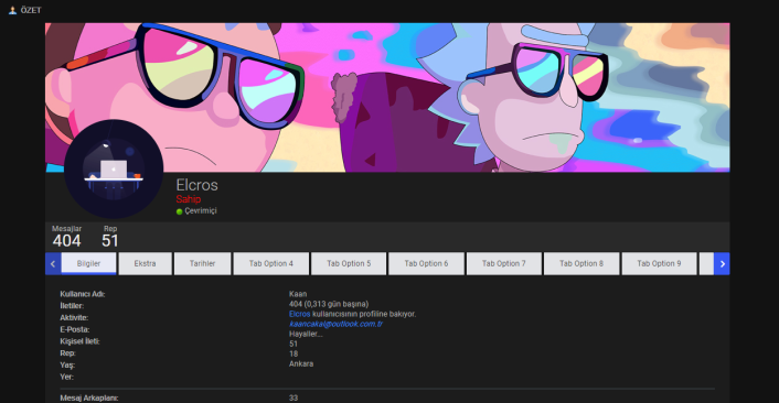
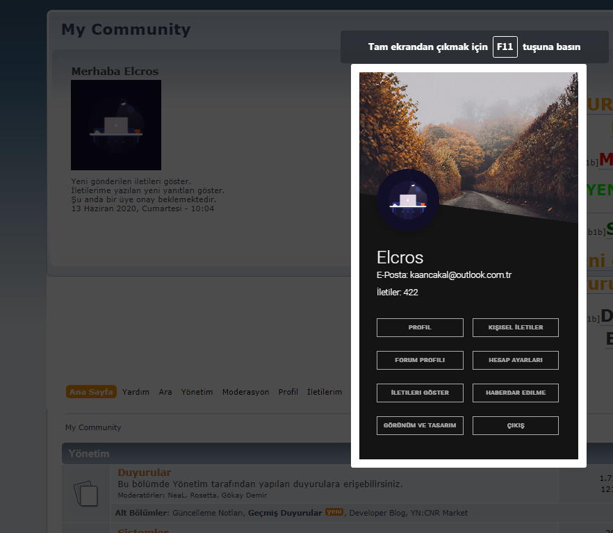
Smf Tema istek ve Editleme / SMF 2.0 Default Tema Avatar'a tıklayınca açılan hızlı menü
13 Haz 2020, 10:14
Avatar'a tıkladığınızda resimdeki gibi menü açılır. Not: Resimde Çıkış var ama problemli olduğu için onu kaldırıp Ara butonu ekledim.
index.css'de en alta ekle:
Themes/default/index.template.php'de Bul:
Değiştir:
Aşağıda verdiğim avatarbilgi.js dosyasını Themes/default/scripts klasörüne at.
Menüdeki resmi değiştirmek için yukarıda dediklerimi yaptıktan sonra index.template.php'deki
index.css'de en alta ekle:
Kod Seç
* {
  box-sizing: border-box;
}

#modal-container {
  position: fixed;
  display: table;
  height: 100%;
  width: 100%;
  top: 0;
  left: 0;
  transform: scale(0);
  z-index: 1;
}
#modal-container.one {
  transform: scaleY(0.01) scaleX(0);
  animation: unfoldIn 1s cubic-bezier(0.165, 0.84, 0.44, 1) forwards;
}
#modal-container.one .modal-background .modal {
  transform: scale(0);
  animation: zoomIn 0.5s 0.8s cubic-bezier(0.165, 0.84, 0.44, 1) forwards;
}
#modal-container.one.out {
  transform: scale(1);
  animation: unfoldOut 1s 0.3s cubic-bezier(0.165, 0.84, 0.44, 1) forwards;
}
#modal-container.one.out .modal-background .modal {
  animation: zoomOut 0.5s cubic-bezier(0.165, 0.84, 0.44, 1) forwards;
}
#modal-container.two {
  transform: scale(1);
}
#modal-container.two .modal-background {
  background: rgba(0, 0, 0, 0);
  animation: fadeIn 0.5s cubic-bezier(0.165, 0.84, 0.44, 1) forwards;
}
#modal-container.two .modal-background .modal {
  opacity: 0;
  animation: scaleUp 0.5s cubic-bezier(0.165, 0.84, 0.44, 1) forwards;
}
#modal-container.two + .content {
  animation: scaleBack 0.5s cubic-bezier(0.165, 0.84, 0.44, 1) forwards;
}
#modal-container.two.out {
  animation: quickScaleDown 0s .5s linear forwards;
}
#modal-container.two.out .modal-background {
  animation: fadeOut 0.5s cubic-bezier(0.165, 0.84, 0.44, 1) forwards;
}
#modal-container.two.out .modal-background .modal {
  animation: scaleDown 0.5s cubic-bezier(0.165, 0.84, 0.44, 1) forwards;
}
#modal-container.two.out + .content {
  animation: scaleForward 0.5s cubic-bezier(0.165, 0.84, 0.44, 1) forwards;
}
#modal-container.three {
  z-index: 0;
  transform: scale(1);
}
#modal-container.three .modal-background {
  background: rgba(0, 0, 0, 0.6);
}
#modal-container.three .modal-background .modal {
  animation: moveUp 0.5s cubic-bezier(0.165, 0.84, 0.44, 1) forwards;
}
#modal-container.three + .content {
  z-index: 1;
  animation: slideUpLarge 0.5s cubic-bezier(0.165, 0.84, 0.44, 1) forwards;
}
#modal-container.three.out .modal-background .modal {
  animation: moveDown 0.5s cubic-bezier(0.165, 0.84, 0.44, 1) forwards;
}
#modal-container.three.out + .content {
  animation: slideDownLarge 0.5s cubic-bezier(0.165, 0.84, 0.44, 1) forwards;
}
#modal-container.four {
  z-index: 0;
  transform: scale(1);
}
#modal-container.four .modal-background {
  background: rgba(0, 0, 0, 0.7);
}
#modal-container.four .modal-background .modal {
  animation: blowUpModal 0.5s cubic-bezier(0.165, 0.84, 0.44, 1) forwards;
}
#modal-container.four + .content {
  z-index: 1;
  animation: blowUpContent 0.5s cubic-bezier(0.165, 0.84, 0.44, 1) forwards;
}
#modal-container.four.out .modal-background .modal {
  animation: blowUpModalTwo 0.5s cubic-bezier(0.165, 0.84, 0.44, 1) forwards;
}
#modal-container.four.out + .content {
  animation: blowUpContentTwo 0.5s cubic-bezier(0.165, 0.84, 0.44, 1) forwards;
}
#modal-container.five {
  transform: scale(1);
}
#modal-container.five .modal-background {
  background: rgba(0, 0, 0, 0);
  animation: fadeIn 0.5s cubic-bezier(0.165, 0.84, 0.44, 1) forwards;
}
#modal-container.five .modal-background .modal {
  transform: translateX(-1500px);
  animation: roadRunnerIn 0.3s cubic-bezier(0.165, 0.84, 0.44, 1) forwards;
}
#modal-container.five.out {
  animation: quickScaleDown 0s .5s linear forwards;
}
#modal-container.five.out .modal-background {
  animation: fadeOut 0.5s cubic-bezier(0.165, 0.84, 0.44, 1) forwards;
}
#modal-container.five.out .modal-background .modal {
  animation: roadRunnerOut 0.5s cubic-bezier(0.165, 0.84, 0.44, 1) forwards;
}
#modal-container.six {
  transform: scale(1);
}
#modal-container.six .modal-background {
  background: rgba(0, 0, 0, 0);
  animation: fadeIn 0.5s cubic-bezier(0.165, 0.84, 0.44, 1) forwards;
}
#modal-container.six .modal-background .modal {
  background-color: transparent;
  animation: modalFadeIn 0.5s 0.8s cubic-bezier(0.165, 0.84, 0.44, 1) forwards;
}
#modal-container.six .modal-background .modal h2, #modal-container.six .modal-background .modal p {
  opacity: 0;
  position: relative;
  animation: modalContentFadeIn 0.5s 1s cubic-bezier(0.165, 0.84, 0.44, 1) forwards;
}
#modal-container.six .modal-background .modal .modal-svg rect {
  animation: sketchIn 0.5s 0.3s cubic-bezier(0.165, 0.84, 0.44, 1) forwards;
}
#modal-container.six.out {
  animation: quickScaleDown 0s .5s linear forwards;
}
#modal-container.six.out .modal-background {
  animation: fadeOut 0.5s cubic-bezier(0.165, 0.84, 0.44, 1) forwards;
}
#modal-container.six.out .modal-background .modal {
  animation: modalFadeOut 0.5s cubic-bezier(0.165, 0.84, 0.44, 1) forwards;
}
#modal-container.six.out .modal-background .modal h2, #modal-container.six.out .modal-background .modal p {
  animation: modalContentFadeOut 0.5s cubic-bezier(0.165, 0.84, 0.44, 1) forwards;
}
#modal-container.six.out .modal-background .modal .modal-svg rect {
  animation: sketchOut 0.5s cubic-bezier(0.165, 0.84, 0.44, 1) forwards;
}
#modal-container.seven {
  transform: scale(1);
}
#modal-container.seven .modal-background {
  background: rgba(0, 0, 0, 0);
  animation: fadeIn 0.5s cubic-bezier(0.165, 0.84, 0.44, 1) forwards;
}
#modal-container.seven .modal-background .modal {
  height: 75px;
  width: 75px;
  border-radius: 75px;
  overflow: hidden;
  animation: bondJamesBond 1.5s cubic-bezier(0.165, 0.84, 0.44, 1) forwards;
}
#modal-container.seven .modal-background .modal h2, #modal-container.seven .modal-background .modal p {
  opacity: 0;
  position: relative;
  animation: modalContentFadeIn .5s 1.4s linear forwards;
}
#modal-container.seven.out {
  animation: slowFade .5s 1.5s linear forwards;
}
#modal-container.seven.out .modal-background {
  background-color: rgba(0, 0, 0, 0.7);
  animation: fadeToRed 2s cubic-bezier(0.165, 0.84, 0.44, 1) forwards;
}
#modal-container.seven.out .modal-background .modal {
  border-radius: 3px;
  height: 162px;
  width: 227px;
  animation: killShot 1s cubic-bezier(0.165, 0.84, 0.44, 1) forwards;
}
#modal-container.seven.out .modal-background .modal h2, #modal-container.seven.out .modal-background .modal p {
  animation: modalContentFadeOut 0.5s 0.5 cubic-bezier(0.165, 0.84, 0.44, 1) forwards;
}
#modal-container .modal-background {
  display: table-cell;
  background: rgba(0, 0, 0, 0.8);
  text-align: center;
  vertical-align: middle;
}
#modal-container .modal-background .modal {
  background: white;
  padding: 2px;
  display: inline-block;
  border-radius: 3px;
  font-weight: 300;
  position: relative;
}
#modal-container .modal-background .modal h2 {
  font-size: 25px;
  line-height: 25px;
  margin-bottom: 15px;
}
#modal-container .modal-background .modal p {
  font-size: 18px;
  line-height: 22px;
}
#modal-container .modal-background .modal .modal-svg {
  position: absolute;
  top: 0;
  left: 0;
  height: 100%;
  width: 100%;
  border-radius: 3px;
}
#modal-container .modal-background .modal .modal-svg rect {
  stroke: #fff;
  stroke-width: 2px;
  stroke-dasharray: 778;
  stroke-dashoffset: 778;
}
.buttons {

  margin: 0 auto;
  padding: 0;

}
.buttons .button {
  display: inline-block;
  text-align: center;

  margin-bottom: 10px;
  margin-left: 10px;
  font-size: 18px;

  border-radius: 3px;

  cursor: pointer;
}
.buttons .button:hover {
  color: white;
  background: #009bd5;
}

@keyframes unfoldIn {
  0% {
    transform: scaleY(0.005) scaleX(0);
  }
  50% {
    transform: scaleY(0.005) scaleX(1);
  }
  100% {
    transform: scaleY(1) scaleX(1);
  }
}
@keyframes unfoldOut {
  0% {
    transform: scaleY(1) scaleX(1);
  }
  50% {
    transform: scaleY(0.005) scaleX(1);
  }
  100% {
    transform: scaleY(0.005) scaleX(0);
  }
}
@keyframes zoomIn {
  0% {
    transform: scale(0);
  }
  100% {
    transform: scale(1);
  }
}
@keyframes zoomOut {
  0% {
    transform: scale(1);
  }
  100% {
    transform: scale(0);
  }
}
@keyframes fadeIn {
  0% {
    background: rgba(0, 0, 0, 0);
  }
  100% {
    background: rgba(0, 0, 0, 0.7);
  }
}
@keyframes fadeOut {
  0% {
    background: rgba(0, 0, 0, 0.7);
  }
  100% {
    background: rgba(0, 0, 0, 0);
  }
}
@keyframes scaleUp {
  0% {
    transform: scale(0.8) translateY(1000px);
    opacity: 0;
  }
  100% {
    transform: scale(1) translateY(0px);
    opacity: 1;
  }
}
@keyframes scaleDown {
  0% {
    transform: scale(1) translateY(0px);
    opacity: 1;
  }
  100% {
    transform: scale(0.8) translateY(1000px);
    opacity: 0;
  }
}
@keyframes scaleBack {
  0% {
    transform: scale(1);
  }
  100% {
    transform: scale(0.85);
  }
}
@keyframes scaleForward {
  0% {
    transform: scale(0.85);
  }
  100% {
    transform: scale(1);
  }
}
@keyframes quickScaleDown {
  0% {
    transform: scale(1);
  }
  99.9% {
    transform: scale(1);
  }
  100% {
    transform: scale(0);
  }
}
@keyframes slideUpLarge {
  0% {
    transform: translateY(0%);
  }
  100% {
    transform: translateY(-100%);
  }
}
@keyframes slideDownLarge {
  0% {
    transform: translateY(-100%);
  }
  100% {
    transform: translateY(0%);
  }
}
@keyframes moveUp {
  0% {
    transform: translateY(150px);
  }
  100% {
    transform: translateY(0);
  }
}
@keyframes moveDown {
  0% {
    transform: translateY(0px);
  }
  100% {
    transform: translateY(150px);
  }
}
@keyframes blowUpContent {
  0% {
    transform: scale(1);
    opacity: 1;
  }
  99.9% {
    transform: scale(2);
    opacity: 0;
  }
  100% {
    transform: scale(0);
  }
}
@keyframes blowUpContentTwo {
  0% {
    transform: scale(2);
    opacity: 0;
  }
  100% {
    transform: scale(1);
    opacity: 1;
  }
}
@keyframes blowUpModal {
  0% {
    transform: scale(0);
  }
  100% {
    transform: scale(1);
  }
}
@keyframes blowUpModalTwo {
  0% {
    transform: scale(1);
    opacity: 1;
  }
  100% {
    transform: scale(0);
    opacity: 0;
  }
}
@keyframes roadRunnerIn {
  0% {
    transform: translateX(-1500px) skewX(30deg) scaleX(1.3);
  }
  70% {
    transform: translateX(30px) skewX(0deg) scaleX(0.9);
  }
  100% {
    transform: translateX(0px) skewX(0deg) scaleX(1);
  }
}
@keyframes roadRunnerOut {
  0% {
    transform: translateX(0px) skewX(0deg) scaleX(1);
  }
  30% {
    transform: translateX(-30px) skewX(-5deg) scaleX(0.9);
  }
  100% {
    transform: translateX(1500px) skewX(30deg) scaleX(1.3);
  }
}
@keyframes sketchIn {
  0% {
    stroke-dashoffset: 778;
  }
  100% {
    stroke-dashoffset: 0;
  }
}
@keyframes sketchOut {
  0% {
    stroke-dashoffset: 0;
  }
  100% {
    stroke-dashoffset: 778;
  }
}
@keyframes modalFadeIn {
  0% {
    background-color: transparent;
  }
  100% {
    background-color: white;
  }
}
@keyframes modalFadeOut {
  0% {
    background-color: white;
  }
  100% {
    background-color: transparent;
  }
}
@keyframes modalContentFadeIn {
  0% {
    opacity: 0;
    top: -20px;
  }
  100% {
    opacity: 1;
    top: 0;
  }
}
@keyframes modalContentFadeOut {
  0% {
    opacity: 1;
    top: 0px;
  }
  100% {
    opacity: 0;
    top: -20px;
  }
}
@keyframes bondJamesBond {
  0% {
    transform: translateX(1000px);
  }
  80% {
    transform: translateX(0px);
    border-radius: 75px;
    height: 75px;
    width: 75px;
  }
  90% {
    border-radius: 3px;
    height: 182px;
    width: 247px;
  }
  100% {
    border-radius: 3px;
    height: 162px;
    width: 227px;
  }
}
@keyframes killShot {
  0% {
    transform: translateY(0) rotate(0deg);
    opacity: 1;
  }
  100% {
    transform: translateY(300px) rotate(45deg);
    opacity: 0;
  }
}
@keyframes fadeToRed {
  0% {
    background-color: rgba(0, 0, 0, 0.6);
  }
  100% {
    background-color: rgba(255, 0, 0, 0.8);
  }
}
@keyframes slowFade {
  0% {
    opacity: 1;
  }
  99.9% {
    opacity: 0;
    transform: scale(1);
  }
  100% {
    transform: scale(0);
  }
}

@import url(https://fonts.googleapis.com/css?family=Roboto:300,400,600);
.snip1336 {
  font-family: 'Roboto', Arial, sans-serif;
  position: relative;
  overflow: hidden;
  margin: 10px;
  min-width: 230px;
  max-width: 315px;
  width: 100%;
  color: #ffffff;
  text-align: left;
  line-height: 1.4em;
  background-color: #141414;
}
.snip1336 * {
  -webkit-box-sizing: border-box;
  box-sizing: border-box;
  -webkit-transition: all 0.25s ease;
  transition: all 0.25s ease;
}
.snip1336 img {
  max-width: 100%;
  vertical-align: top;
  opacity: 0.85;
}
.snip1336 figcaption {
  width: 100%;
  background-color: #141414;
  padding: 25px;
  position: relative;
}
.snip1336 figcaption:before {
  position: absolute;
  content: '';
  bottom: 100%;
  left: 0;
  width: 0;
  height: 0;
  border-style: solid;
  border-width: 55px 0 0 400px;
  border-color: transparent transparent transparent #141414;
}
.snip1336 figcaption a {
  padding: 5px;
  border: 1px solid #ffffff;
  color: #ffffff;
  font-size: 0.7em;
  text-transform: uppercase;
  margin: 10px 0;
  display: inline-block;
  opacity: 0.65;
  width: 47%;
  text-align: center;
  text-decoration: none;
  font-weight: 600;
  letter-spacing: 1px;
}
.snip1336 figcaption a:hover {
  opacity: 1;
}
.snip1336 .profile {
  border-radius: 50%;
  position: absolute;
  bottom: 100%;
  left: 25px;
  z-index: 1;
  max-width: 90px;
  opacity: 1;
  box-shadow: 0 0 15px rgba(0, 0, 0, 0.3);
}
.snip1336 .follow {
  margin-right: 4%;

}
.snip1336 h2 {
  margin: 0 0 5px;
  font-weight: 300;
    color: #fff;
}
.snip1336 h2 span {
  display: block;
  font-size: 0.5em;
  color: #fff;
}
.snip1336 p {
  margin: 0 0 10px;
  font-size: 0.8em;
  letter-spacing: 1px;
  opacity: 0.8;
}
Themes/default/index.template.php'de Bul:
Kod Seç
	if ($context['user']['is_logged'])
	{
		if (!empty($context['user']['avatar']))
			echo '
				<p class="avatar">', $context['user']['avatar']['image'], '</p>';
		echo '
				<ul class="reset">
					<li class="greeting">', $txt['hello_member_ndt'], ' <span>', $context['user']['name'], '</span></li>
					<li><a href="', $scripturl, '?action=unread">', $txt['unread_since_visit'], '</a></li>
					<li><a href="', $scripturl, '?action=unreadreplies">', $txt['show_unread_replies'], '</a></li>';
Değiştir:
Kod Seç
	if ($context['user']['is_logged'])
	{
		if (!empty($context['user']['avatar'])){

		echo '

				<div id="modal-container">
  <div class="modal-background">
	 <div class="modal">
<figure class="snip1336">
  <img src="https://s3-us-west-2.amazonaws.com/s.cdpn.io/331810/sample87.jpg" alt="sample87" />
  <figcaption>
	 <img src="',$context['user']['avatar']['href'],'" alt="profile-sample4" class="profile" />
	 <h2>', $context['user']['name'], '<span>', $txt['email'], ': ',$context['user']['email'],'</span>
	 <span class="ozet-bilgi">İletiler: ', $context['user']['messages'], '</span></h2>
		<a href="?action=profile" class="follow">',$txt['profile'],'</a>
		<a href="?action=profile;area=pmprefs;" class="info">',$txt['personal_messages'],'</a>
		<a href="?action=profile;area=forumprofile" class="follow">',$txt['forumprofile'],'</a>
		<a href="?action=profile;area=account;" class="info">',$txt['account'],'</a>
		<a href="?action=profile;area=showposts;" class="follow">İletilerimi Göster</a>
		<a href="?action=profile;area=notification;" class="info">Haberdar Olma</a>
		<a href="?action=profile;area=theme;" class="follow">Görünüm ve Tasarım</a>
		<a href="?action=search" class="info">',$txt['search'],'</a>
  </figcaption>
</figure>

	 </div>
  </div>
</div>

  <div class="buttons">

	 <div id="six" class="button">', $context['user']['avatar']['image'], '</div>

  </div>

<!-- partial -->
  <script src="https://cdnjs.cloudflare.com/ajax/libs/jquery/2.1.3/jquery.min.js"></script><script  src="Themes/default/scripts/avatarbilgi.js"></script>';
}
					echo '
				<ul class="reset">
					<li class="greeting">', $txt['hello_member_ndt'], ' <span>', $context['user']['name'], '</span></li>
					<li><a href="', $scripturl, '?action=unread">', $txt['unread_since_visit'], '</a></li>
					<li><a href="', $scripturl, '?action=unreadreplies">', $txt['show_unread_replies'], '</a></li>';
Aşağıda verdiğim avatarbilgi.js dosyasını Themes/default/scripts klasörüne at.
Menüdeki resmi değiştirmek için yukarıda dediklerimi yaptıktan sonra index.template.php'deki
Kod Seç
<img src="https://s3-us-west-2.amazonaws.com/s.cdpn.io/331810/sample87.jpg" alt="sample87" />kodunda src= olan yerdeki linki istediğiniz resmin linkiyle değiştirin.
#5
Smf Tema istek ve Editleme / SMF Profilde Aktivite Gösterme Modsuz
11 Haz 2020, 02:22
Modlu olarak kullanıyordum daha önce bir daha ihtiyacım oldu ben de kendim yazdım kodu baştan, çok basit tek adımda yapılıyor.
Temanızda varsa temanızdakindeki yoksa default temadakindeki Profile.template.php'yi açın.
Bul:
Sonrasına Ekle:
Profil sayfasında İleti sayısının hemen altında Aktivite: Ana Sayfa'ya bakıyor. tarzında gözükecek.
Temanızda varsa temanızdakindeki yoksa default temadakindeki Profile.template.php'yi açın.
Bul:
Kod Seç
<dd>', $context['member']['posts'], ' (', $context['member']['posts_per_day'], ' ', $txt['posts_per_day'], ')</dd>';Sonrasına Ekle:
Kod Seç
//Kullanıcı çevrimiçiyse aktiviteyi göster
if ($context['member']['online']['text'] == "$txt['online']")
{
echo'
<dt>Aktivite:</dt>
<dd>', $context['member']['action'], '</dd>
';
}
Profil sayfasında İleti sayısının hemen altında Aktivite: Ana Sayfa'ya bakıyor. tarzında gözükecek.
#6
SMF 2.0.x Karşılaştığınız Sorunlar ve Çözümleri / Son İletilerde Bir Konunun Bir Defa Gözükmesi
05 Haz 2020, 17:17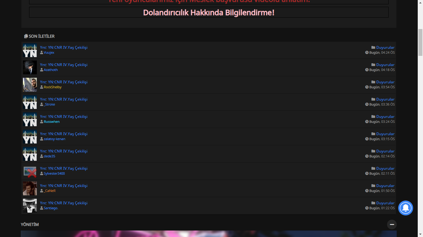
Şu görüntüyü istemiyorum, bir konuya mesaj atıldıysa son iletilerde o konu bir kere gözüksün istiyorum. Nasıl yapabilirim?
#7
Webmaster Genel Sorunları / "Oturum doğrulaması başarısız oldu." Hatası
16 Mayıs 2020, 19:54
SMF sürümüm 2.0.17. Şifremi 2 kere yanlış girdiğimde
SMF 2.0.15'den 2.0.17'ye update ettim.
Kod Seç
Oturum doğrulaması başarısız oldu. Lütfen oturumunuzu kapatıp tekrar giriş yapmayı deneyin. diye hata veriyor.SMF 2.0.15'den 2.0.17'ye update ettim.
#8
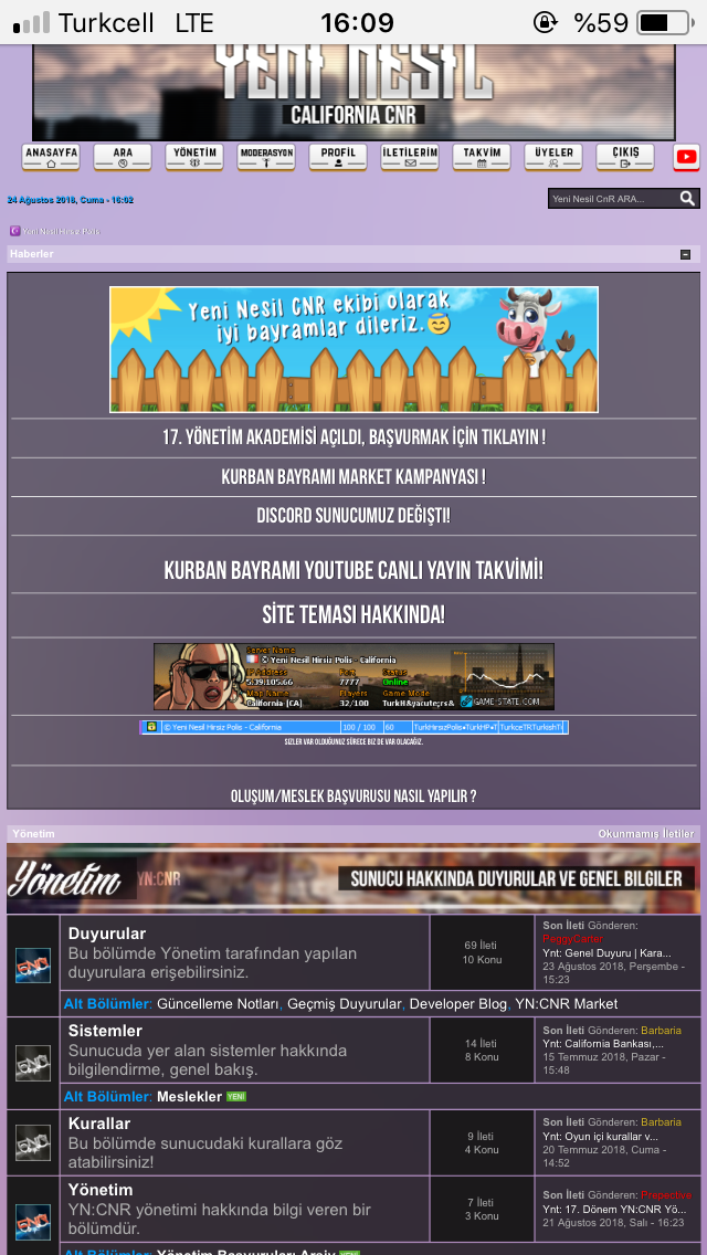
Smf Sitenizi Tanıtın / yeninesilcnr.net Tanıtım Konusu
20 Ara 2019, 13:23Sitenizin Linki:www.yeninesilcnr.net
Sitenizin ismi:YeninesilCNR
Site Sloganı:Yok
Sitenizin Açılış Tarihi:06 Haziran 2016
Tanıtım:Gta san andreas samp hırsız polis sunucusu forumu.
#9
SMF Kurulumu, Sorunları ve Duyuruları / Yazılanlar Gözükmüyor Fakat Değiştir Dendiğinde Varlar
18 Ara 2019, 19:21
Konuya girince yazılan hiç bir şey gözükmüyor fakat değiştir dediğimde mesaj var,bu sorunun sebebi nedir ?
#10
Smf Tema istek ve Editleme / Smf slider yapımı
18 Ara 2019, 13:42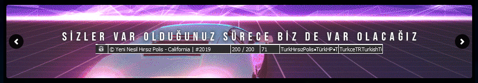
(Arkadaki siyah kısımlar dahil değil sitenin arkaplanı.)
Ücretli satılan slider modun manuel yapımıdır.Ekleyeceğiniz resimler 950x150 boyutunda olmalı.
Siteniz Font Awesome kullanımına hazır/uygun olmalı.
<li style="background:url(950x150 resim urlniz);"></li> kodunu alt alta ekleyip resim urlsini değiştirerek yeni resimler ekleyebilirsiniz.
Themes klasörüne "slider" isminde klasör açmanız ve konunu aşağısında verdiğim slider.rar'ı indirip arşivin içindekileri içine atmanız gerek.
Demo
Themes/default/BoardIndex.template.php 'de bul;
Kod Seç
echo '
 <div id="boardindex_table">
üstüne ekle;
Kod Seç
echo'
<div id="slider" >
  <i class="sliderbutonl fas fa-angle-left"></i>
<i class="sliderbutonr fas fa-angle-right"></i>
  <ul style="width: 2500px; margin-left: -950px;">
<li style="background:url(950x150 resim urlniz);"></li>
</ul>
</div <script  src="/Themes/slider/slider.js"></script>
<link rel="stylesheet" href="/Themes/slider/slider.css">
<script type="text/javascript" src="/Themes/slider/slider.js"></script>
 ';
#11
SMF Kurulumu, Sorunları ve Duyuruları / smf 2.0.15 den 2.1'e geçiş
18 Ara 2019, 10:18
2.0.14 den 2.0.15 e geçtiğimde türkçe karakter sorunu yaşamıştım ve veritabanını indirip notepad+ ile düzeltmek zorunda kalmıştım bunun olmaması için yapabileceğim bir şey var mı 2.1 e geçerken ?
#12
Çözülenler / Like Mod Butona Tıklayınca Tepki Vermiyor
14 Eyl 2018, 18:07
Like modunu kurdum ama butona tıklayınca hiç bir şey olmuyor sayfayı yenileyince beğendiğim gözüküyor nasıl çözebilirim
#13
Smf Tema istek ve Editleme / Emojileri drop menu olarak yapmak istiyorum
11 Eyl 2018, 13:42
Emojileri font seçimi yaptığımız gibi yapmak istiyorum veya ileti simgesi gibi işte üzerine tıklayınca açılan bi menü şeklinde yani.Nasıl yapabilirim ?
#14
Çözülenler / My Mood mod
09 Eyl 2018, 22:46
https://www.simplemachines.org/community/index.php?topic=500315.0
böyle bir mod varmış fakat artık indirme linklerinin hiç biri çalışmıyor ve ücretli satıyorlar bir sitede,klasik instagrama durum atar gibi profilinden durum güncelliyorsun ve anasayfada son iletiler gibi son durumlar şeklinde gözüküyor bunu kendimiz nasıl yapabiliriz yardımcı olabilecek var mı ?
böyle bir mod varmış fakat artık indirme linklerinin hiç biri çalışmıyor ve ücretli satıyorlar bir sitede,klasik instagrama durum atar gibi profilinden durum güncelliyorsun ve anasayfada son iletiler gibi son durumlar şeklinde gözüküyor bunu kendimiz nasıl yapabiliriz yardımcı olabilecek var mı ?
#15
Smf Tema istek ve Editleme / Board ID ye göre stats ve lastpost nasıl değişilir ?
04 Eyl 2018, 23:13
board_51 diyelim bunun childerınını kapatmak stats kısmını ve last post kısmını kapatmak istiyorum fakat bu işlemler sadece o boardda olsun istiyorum bunu nasıl yapabilirim?
Aşağıdaki gibi özel bir bölüm yapmak istiyorum

Aşağıdaki gibi özel bir bölüm yapmak istiyorum
#16
Smf Tema istek ve Editleme / Boardİndex'e Html Kod Ekliyorum Ard Arda 6 tane Çıkıyor
28 Ağu 2018, 19:01
Bunun gibi 6 tane ard arda çıkıyor bir tane çıkması gerekirken bunun için bir html kod eklenmesi gerekiyordur elbet ama ben bilmiyorum boardindex.template.php de yapıyorum işlemi.
#17
Smf Tema istek ve Editleme / Pro Slider Mod Benzeri Nasıl Yaparız ?
27 Ağu 2018, 23:15
https://www.youtube.com/watch?v=F9mpdAWl8dE
videodaki mod ücretli bunu kendimiz yapabilir miyiz veya benzeri bir mod var mıdır ?
videodaki mod ücretli bunu kendimiz yapabilir miyiz veya benzeri bir mod var mıdır ?
#18
Smf Tema istek ve Editleme / Mobilde Yandaki Boşluklar Birbirinden Orantısıx
24 Ağu 2018, 16:13
Sağdaki boşluk soldakinden daha fazla çok kötü duruyor nasıl ayarlayabilirim?
ŞU AN;
BÖYLE OLMASINI İSTİYORUM;
ŞU AN;
BÖYLE OLMASINI İSTİYORUM;
#19
Smf Tema istek ve Editleme / SMF 2.0.X bbc butonları nasıl png yapılır ?
23 Ağu 2018, 22:08
Default temanızın klasöründen GenericControls.template.php'den
Bu işlemi yaptıktan sonra kullandığınız temanın images klasöründen bbc klasöründeki resimlerin hepsinin png versiyonunu yapıp aynı klasör içine atın.
Kanıt;

Gördüğünüz gibi png formatında olmayan bütün buton resimleri gitti,png olan buton resimleri ise gözüküyor.
Hepsini düzenledikten sonra;

İyi çalışmalar.
Kod (Bulun) Seç
sImage: ', JavaScriptEscape($settings['images_url'] . '/bbc/' . $tag['image'] . '.gif'), ',Kod (Değiştirin) Seç
sImage: ', JavaScriptEscape($settings['images_url'] . '/bbc/' . $tag['image'] . '.png'), ',Bu işlemi yaptıktan sonra kullandığınız temanın images klasöründen bbc klasöründeki resimlerin hepsinin png versiyonunu yapıp aynı klasör içine atın.
Kanıt;
Gördüğünüz gibi png formatında olmayan bütün buton resimleri gitti,png olan buton resimleri ise gözüküyor.
Hepsini düzenledikten sonra;
İyi çalışmalar.
#20
Smf Tema istek ve Editleme / Mobile Girince Zoom Yapılmış Yere Geri Atıyor
20 Ağu 2018, 13:58
Hocam sitem mobil uyumlu değil fakat eskiden girdiğim zaman direk ekrana sığıdırıyordu sayfayı şimdi ise açtığınız sayfa da bi yeri zoomladınız diyelim yenilediğinizde de aynı o şekilde oraya zoomlu açıyor tekrar nasıl ekrana sığdırarak açmasını sağlayabilirim ? Sitem : yeninesilcnr.net @Tarantula
Sayfa1